Today we are looking at the mobile version of TheDebrief.org, which is a curated news website focused on several popular but dissimilar niches. A trusted SEO source mentioned this website on X / Twitter in the context of a website that is thriving in organic search.
If you’re new here, my approach to an initial mobile site audit is to consider myself a first time visitor and react to each aspect of the website’s design and structure as though I’m seeing it for the first time. Most of the time I am, but occasionally I review websites I’ve come across before.
A Few Pointers on the Desktop Version
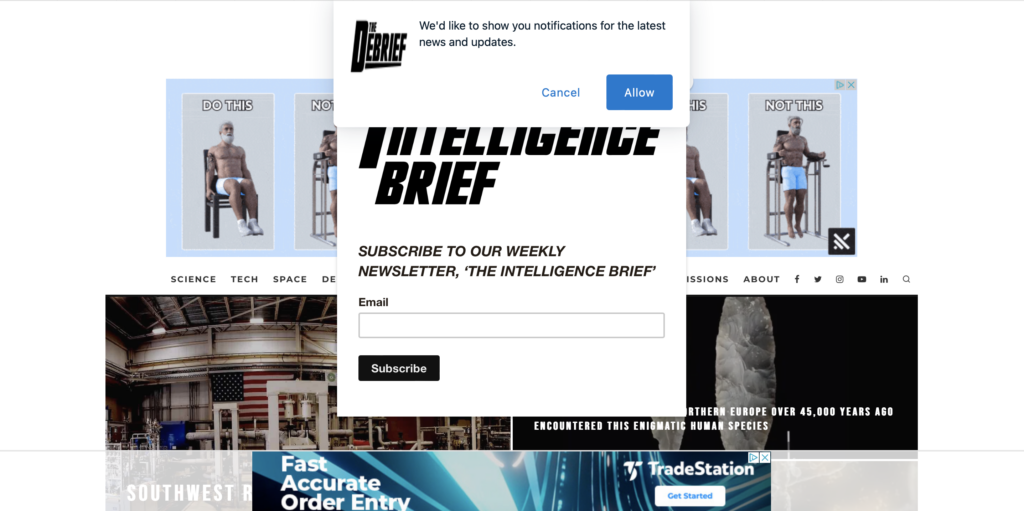
I normally don’t mention the desktop version of websites during my audits, but as I pulled a screenshot for this post, I saw the obstructed view and had to mention it.
Take a look at the screenshot above. Who here can read anything on that home page? I count no less than five distractions on the home page above the fold. Let’s count them together:
- Ad above the navigation links
- Ad at the bottom of the page
- Pop up newsletter subscribe form
- Pop up opt-in for notifications of latest posts
- Video ad runs and then disappears over and over in the lower right corner.
I have to close three different objects on the home page just to see what it looks like. And even then the ad between the logo and the navigation links takes up half the height of my screen.
Other than during a website audit, there’s literally no website important enough to justify the time and effort I endured just to see what the website has to offer.
In other words, If you make it difficult for visitors to see your website, don’t be surprised when they give up trying.
That’s it. I just had to get that off my chest. I have no idea how good the content of the website is because it appears that they don’t want my attention.
So how much is too much? Where’s the line?
Given that there are 5 obstacles to reading the home page immediately when it loads, you might be wondering how many ads/pop ups you can get away with before a first time visitor like myself stops trying and clicks away from the site.
My answer: I would endure a footer ad and a newsletter form pop up. The footer ad allows me to see most of the content on the screen and the newsletter pop up is a single click action I would take to continue looking over the web page.
Let’s look at the mobile version
Here’s the video of my mobile audit. Scroll past to see the summary of my findings:
- He notes absence of a visible logo and the presence of an advertisement at the bottom.
- The small, all-caps, boxy font used for headlines makes it challenging to read.
- First time visitors need a motivating reason to stay on the website.
- The homepage features a mix of diverse topics without a clear thematic focus.
- The site uses infinite scroll, causing the footer and other sections to be invisible.
- The thumbnail image is broken on the podcast page, affecting the brand’s perception.
- He explores the About page and notes the mission statement and contributors listed.
- Clicking on an article, he observes that the font size and style make it hard to read titles.
- He suggests increasing the font size, adding more space between titles and images, and avoiding overlapping text.
- He believes that addressing these issues could significantly increase user engagement.
- He concludes by inviting questions, comments, and scenarios for further discussion.
Overall, this mobile site audit highlights the website’s usability and content presentation issues. The feedback provided aims to improve the user experience and engagement on the site. These insights offer valuable suggestions for enhancing the website’s design and readability.