Hey, guys. Welcome to SearchMatters.com. My name is Daniel, and today I am reviewing MyBikeRental.net. But before we dive in, I just want to remind you that at SearchMatters.com, I review your website on a mobile device, recording it on video for 10 minutes. I walk through your website as though I am a first time visitor and I give you real time feedback on what the experience is like.
I point out things that are obstacles to me finding information I’m looking for, or obstacles to completing a task, such as subscribing or giving lead gen information or purchasing a product.
[This article is a transcript of that video site audit]
In that process, I also will give you input on things that could be changed, low hanging fruit – things that you could do quickly in order to see a significant increase in the number of conversions or sales on your website. Mobile is really important because 60%+ of most industries are going to have their sites visited on mobile phones. So the majority of your traffic is coming through mobile phones. You want to be optimized for mobile.
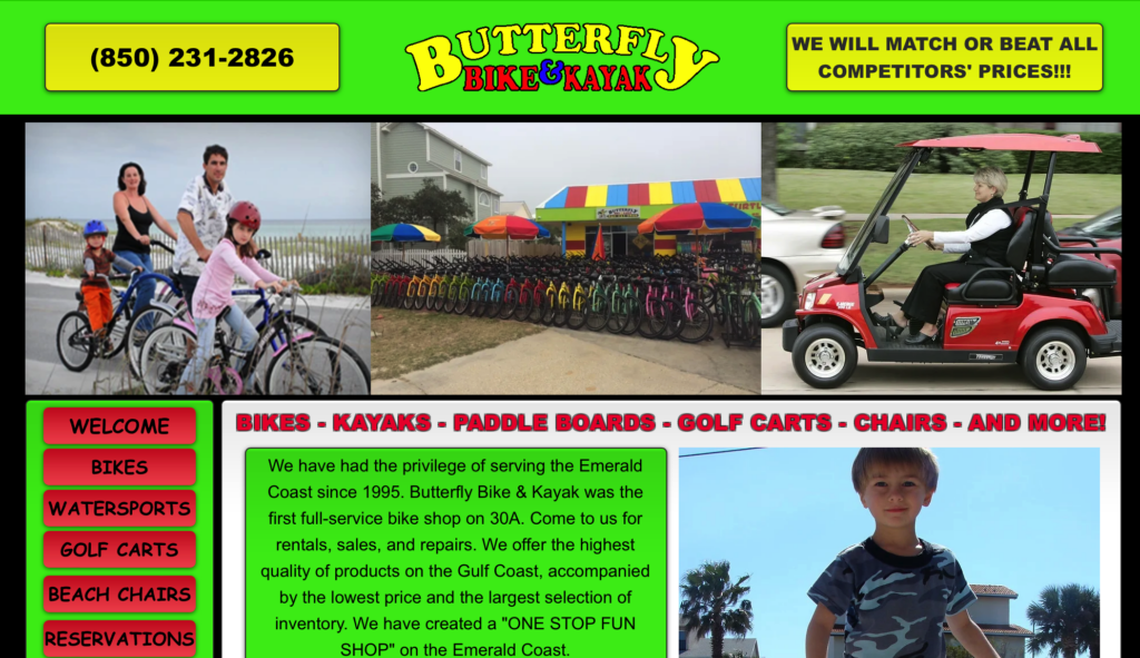
All right, so let’s dive in. This is MyBikeRental.net.
The Audit
We’re offering suggestions and input on ways to make improvements. The number one thing I noticed here is the color scheme is very bright and so I am drawn to just noticing the contrast of greens, reds, yellows and blues. The thing that I am bothered by most immediately is that I can’t read anything on this screen, except I can read the blue text and some of the red text in the footer. But the main body of the content is too small. I can tell you just by looking at this, that this website, whoever designed it, was designed for a desktop computer view.
It’s now literally just being shrunk to fit inside the screen parameters of a mobile device. It’s not adjusting at all. When we talk about having a design that works for both desktop and mobile, this is not the approach we’re talking about. We’re not talking about just basically shrinking it down because that approach makes everything unreadable on a smaller screen.
What you want is a responsive theme or responsive design that literally has coding involved in the design that changes positions and sizes of elements of your theme’s design so that they fit and are readable on a phone. Right here, what I’m going to have to do is I’m going to use my thumbs and I’m going to stretch out the design. I am able, of course, with any phone, I’m going to be able to read (by doing this).
But then that would be the argument some business owners or designers will make who haven’t modified to the responsive approach. They’ll say, Well, everything IS readable. You literally just have to zoom in, pinch to zoom. That’s not wrong. However, this is how you lose customers. Because imagine there are et’s just pull up here just to see what they do.
Answering the What
So they offer bike and kayak rentals. Now, imagine this is a vacation destination that rents out bikes and kayaks. Now, there are maybe 10 or 20, let’s just say, 10 companies offering the same service. But the nine other companies, or even just seven of the other companies, have a website design that when you open it up, it’s immediately readable. You don’t have to pinch to Zoom.
There are no stark color contrast of the red, green, and yellow, but it just looks more pleasing to the eye. In those moments, that first impression is so much better that a person’s inclination is more likely to stay and to browse to look at what the offerings are, the pricing, the stipulations for how long you can rent, and all those things, availability.
What Your Design Instantly Says About Your Business
But here, there’s a much higher chance that the person leaves because the question is, do you want to take this company seriously? If you’re going on vacation, are you investing your time in a company that you can’t even read their website? Because that says something. Your brand says everything about your professionalism, your position on excellence, following through. Are you a company that cares about the details?
Because as a person who’s renting or taking the time to go on a vacation and putting a lot of time, effort, and money into that process, I want companies that service me to make me feel safe, to make me feel confident. I know that I can rely on them, or at least I believe I can. I believe they’re going to show up. They’re going to do exactly what they say. Their product is going to be quality. If there’s any problems, they’re going to be quick to resolve them. The very first impression I have of this company is their website, and so they need to really convince me.
If you want to look at this a different way, the website is not always going to convince someone to be a customer, but the website absolutely can convince a customer to not be a customer, to convince a person to not be a customer because they don’t feel safe, they don’t feel confident, they don’t feel just really at ease with the idea of this brand. Here we have, I haven’t even gone through the design yet, and we’re already deep into the time of this review.
Looking at Categories
I’m going to expand to look at our categories. First, we have a phone. I will say, because it’s a local company and most likely people looking to rent, are probably going to make a phone call rather than schedule online. Or at least if you’re on a vacation, there are two types of customers. One is going to reserve in advance. They may do that online if there is a web form they can fill out to reserve their bikes or kayaks.
However, there’s also going to be a set of people who arrive, decide, “Oh, we’re here. We’re near a beach. We don’t actually know what we want to do with our time here, and we’ve decided we would like to have a bike bicycle outing”, or, “We want a couple of days to go ride some trails or just see the rest of the town with bicycles”.
So for those people, a phone call may be actually the faster path for them. So it’s good to have this call to action. The logo is very easy to see. They also make a statement, which I think is pretty important here. It says, We will match or beat all competitors’ prices.
Assessing the Offer
Matching is not really all that compelling to me. I think that would strike that from the message because if I’m already looking at some other website and they have good pricing, you offering to match isn’t compelling.
I already have somebody who can do it. So unless you have wowed me with your branding or the style of your bikes and kayaks, if you have a superior product, then maybe matching their price is compelling. But otherwise, just being the same as somebody else I have seen isn’t compelling. But telling me that you will beat all competitors prices would let me know, All right, well, I might go out and see what the other price points are, but I know I’m going to come back here because they’re going to beat that price. So that would be a little bit more compelling to me.
Now, here we have a list of items here in red, bikes, kayaks, paddle boards, golf carts, chairs, and more. That’s a lot of different things. I’m reading here, we have everything to make memories. Okay, they said the areas that they service. So we have a bunch of different beach areas and says, let’s just pinch out a little bit.
Other Compelling Features
“Can’t come to us, we’ll come to you.” So they have free delivery and pickup. I think I would make that probably a message at the top. I would want the primary messages to be, we’ll beat any price, free delivery and pickup. And here’s the areas that we service.
Those three pieces of information – the faster you can provide those to me, the more quickly I can make a decision to keep reading. Free roadside assistance, that’s quite an offer. These are compelling reasons to use a company. Our bikes come with locks. I didn’t even read this even though it was in blue. Our bikes come with locks, free baskets and helmet available upon request. Okay, so that’s also worth knowing. Now, we haven’t even changed the page yet, so let’s quickly dive in. Let’s just look at bikes.
We’re talking a lot about bikes, so I want to see what they offer. All right. I had it pinched in to Zoom, so I didn’t see the whole page. This is what I see when I go to the bikes page. Zoom all the way out. Again, I can’t read any of the text except kids bikes and adult bikes.
Pinch to Zoom is Frustrating
I have to pinch to Zoom again and it says click below, which tells me that if I click, it’ll offer me something new. Again, for anyone who makes the argument, you can just pinch to Zoom on my website, so it’s not a problem. One, you’re requiring me to make an extra step in order to get to the same information that another website will not require me to pinch to Zoom.
So I save time and effort and I’m less likely to be frustrated in a frustrated state of mind if I’m on another website that doesn’t require this. Second thing is, as you just saw, when I click a link and it takes me to the next page, I’m still in the pinch to Zoom format, so I don’t get to even see the layout of the whole page.
Now I have to perform another task, which is to zoom out. I have to pinch out so I can see the entire page, then realize, of course, that I can’t read it, but I just needed to see what was on the page. Now I have to zoom in again to see what else is on the page.
Losing Customers with Unnecessary Steps
So that’s three actions now I’ve had to take in order just to see what’s happening on this page. Now we have a list of kids bikes by size or gender. And I’m just taking a quick look, see now there’s these red buttons. We have a yellow background, which is not a no no by itself. I mean, it does cause the picture to stand out.
However, the red button has some text in it. It’s completely unreadable. I’m going to zoom in now. I had to get about this big to realize what the button says. And if this was a mobile responsive design, that’s about the size that these images and buttons would be just by scrolling through the page. And so this is what I automatically would see.
But now I had to actually perform an action in order to enlarge the text. They have two buttons, Add to Cart or Add to Cart with training wheels. I understand that that’s a workaround for a software that doesn’t have the modification process inside the shopping cart where you choose inside. This button just does that for you. In 2023, it’s not ideal, but it does get the job done.
How Mobile Responsive Design Would Help Shopping
I’m scrolling back out so I see different bikes. There’s quite a few different bike options here. There’s a tag along option. You can attach that to a bike so that you have an extra person involved. There’s a Caboose bike and baby seat. I scroll back out or I zoom back out. There’s adult bikes.
Then there are links to water sports, and I’m zooming back in. One person, two person, paddle board, yolo yak. I’m actually getting a little bit of fatigue in reviewing this site simply because what I’ve run into is all the actions I have to perform in order to see the content.
You might argue, and I’m mentioning this because I want to be fair to anyone who has a small business and maybe you just have what you have… The website you have, you’ve had for a while, you don’t know how to build a website, you don’t have the money to pay someone to build a website. And so you’re looking for an argument to not change what you currently have. And the one argument that I could imagine you make, besides just there’s literally no money around to do this, the one argument you could make is, well, you’re talking about having to take actions to see what’s on the page.
Mobile Responsive Design Changes Page Layout
But if it was a mobile responsive design, what you would have is basically, as you’re looking at products, you’d have probably something along the lines about this size. And now if there are 20 products on the page, how many times are you going to scroll?
So my finger is doing scrolling right now, and it’s not formatted for mobile responsive design. But imagine that it was. I could be scrolling 20 times just to get a view of all the products on the page. So one argument for not having a mobile responsive design for e-commerce might be, well, it would be better to see how many products are listed on the page and then pinch to zoom in on what you think is the most likely interesting product because it’s faster.
And I hear that. I’m not ignoring that reality. That’s a factor that we do lose a little bit when it comes to mobile responsive design. We do a lot of scrolling. In my ideal world, a mobile responsive design would start off like this. And then this is my wish list. I’m not saying that people do this or that the technology is available. But if this was the standard format, I would like the ability to pinch out and see all products in one screen.
Readability is #1
I know this sounds like a little bit like reverse psychology here, but I want to be able to immediately read, and so I need font sizes that are large enough to read. I need to know what the buttons say. This should be a bolded white text or a different colored button on the buttons. This Add to Cart needs to be way more visible.
But I need to be able to read everything on the page. Then if I’m wondering, Well, how many bicycles are actually on this page? I don’t want to scroll through 20. Then the ideal would be to be able to pinch out in order to see the whole page. But that’s not a functionality that I’ve really seen happen.
So we’re going to stick with what is considered best practice, which is the responsible single column scrolling view. Then I want to encourage you to reconsider. If you have a lot of products on the page, because of the fact that mobile devices are what they are, they need a single column layout. The question is, how many products should you actually put on a page before continuing on to a next page?
How Mobile Navigation Affects Conversion
Navigation becomes really important and site structure becomes really important for a mobile website. Because, again, not only do I have to do a lot of scrolling if there are 20 plus products on the page, I’m also likely to forget the product that I saw further up in the page that I liked or was interested in. So there’s that issue is how do I scroll back to find the one that caught my eye? So that process could get frustrating.
So then for mobile design, perhaps there is an argument for limiting the number of products to, say, five or maybe at most 10, but really keeping a limit on the number of products before there is a button for next page. And then you need to think about, well, if there are so many options that they can scroll, that they can hit next page, next page, and there’s five, six pages, what can I do for navigation in order to simplify the search?
What options can I give my visitor to help them select more what they want at the beginning? Kind of like in Amazon, there are criteria, or even Home Depot Lowe’s. A lot of websites are apps today.
E-Commerce Features
If you go and look, there’s a sidebar and you can reduce the number of options by choosing a price point or by choosing a color or by choosing a size or by choosing a set of brands. You can limit the results. That’s one way to weed out just too many options. That’s really important to have something along those lines.
Maybe you don’t have that functionality, but perhaps you need more navigation where you have subcategories for your products. So if I’m going to have bikes with what we call bikes with training wheels, that might be a subcategory link. So when I look at my options for products, I choose between, do I want to look at kids bikes or do I want to look at kids bikes with training wheels? And maybe if I split those into two, there’s at least in some cases that would help me to weed out the options I don’t like.
There’s fewer to scroll through and I can get to the product I want faster. That was a lot of words. We’re going to go ahead and conclude this one. We didn’t get too deep into the site because there were just a couple issues that were really important and felt the need to elaborate on, even though they don’t just relate to this website.
The Takeaways From Today’s Audit
I always look for topics that we can elaborate on so that anyone watching can have some takeaways for their own mobile website design. Today I want to recap real fast.
The things they did well on this website were:
- They put their phone number easily visible at the top left.
- They have an offer or a statement of value they are competitive, they are competitive. They will match or beat all competitor prices. Both are in the top easy to see.
There are other compelling details. Oh, I’m not on the homepage, so that doesn’t work. I’m going to try to click. I have to go to the left and hit the Welcome. That’s another thing. I want to be able to click the logo at all times, so we’ll add that to the list of things I’d like to see improved. But now that we’re back at the homepage, there are some details down here in this yellow footer that give me more context, the things that might sell me on this particular service.
There you have it. We have reasons to consider using this service, and then we have reasons to not.
First being, I can’t read the text without Zooming in.
Two is the color scheme reminds me a little bit of the late 90s before Google became the de facto search engine, and we had a lot of MSN groups and Yahoo groups websites and Zing websites, all those very colorful background websites. It’s a little reminiscent of that. But yeah, mostly it’s readability.
The logo is not clickable. So to get back to the home page, I have to know that I have to go zoom in to the left, then click the Welcome, and it doesn’t even say home. So I just need to know that. And then because I have to zoom in to read everything, once I’ve clicked a link, I’m in a zoomed format, so I can’t see what the page is like.
And if this was a mobile responsive design, I would just be scrolling through the whole website, but I can only get a very small portion if I try to scroll because I’m in zoom mode. So what I have to do is zoom out, see the whole page, look for the part I actually want to know more about, say this copy, then I have to zoom in to read it.
And then I’m going to be zooming in and out again in order to see other parts of the page. This is likely to cause me to look elsewhere. It’s really easy to just bounce and hit the back button and go visit another bike rental site. Likely, I won’t have these particular issues. I hope that’s helpful.
Let me know if you have any questions. Leave me a comment, send me a contact form on my website at SearchMatters.com/contact, or you can reach out to me on Twitter at @GoSearchMatters. Thanks and have a great day!